Real improvement over the old logo. I particularly like that we are now referring to ourselves as U.S. Masters Swimming rather than USMS. If we are trying to attract new members and we are all on occasion walking billboards with meet t-shirts, who knows what USMS means besides those who are already members. I have any number of meet t-shirts in which neither the graphics or text give any indication that it is actually from a swimming event. Kudos to the group who picked the name change and the design.
It is useless to argue a point with someone who persists in bringing politics into a conversation where they are not relevant.
It is useless to argue a point with someone who does not capitalize anything.
It is useless to argue a point with someone who changes the focus of conversation to avoid defending their position.
You can bash the logo all you like. I do not need to defend the process that created it, although I thought some might appreciate the work that it took. I obiously misjudged the last thought.
The new logo is good with me - (the FIRST time I saw it I thought it was Rob Butcher riding on a magic carpet, waving to the crowd below.)
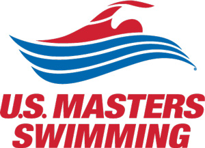
The font/typeface is another matter. I agree with the previous posts - Very bad. The font is way too bulky, large, and heavy. (Kinda like me when I swim early mornings.) It looks clunky. (Kinda like me when I swim early mornings.) It overwhelms the logo when they are side by side. It slows down the swimmer in the logo - it's an impediment in front of him pushing him back. (At least put it behind the swimmer so he has open water in front of him to continue.) The text doesn't seem to be appropriately selected to go with a smooth, sleek, fluid logo - graphically they are incompatible. Yes, that's right - they are incompatible.
Many times, companies will also design their TEXT to be trademarked - (IBM with its lines through the letters, Dell with the sideways E, Exxon with the X's connected below each other.) Doing something like that would also make the text our own, too, but for now it is not.
One more thing - why the periods in U.S. Why so tiny? I thought they were Volcano Taco crumbs on my computer screen. They bother me - take them out. It looks better without them and provides a double entendre: "United States" and "us." They disappear anyway when the whole thing is reduced.
Three problems:
1. The swimmer looks like the hand is cut off. It doesn't look like swimming feels. And it is not abstract enough to be just a symbol.
2. It looks like a minor variant on Obama's campaign design.
3. The restrictions on its use restrict its use. A whole line of nice but not official looking apparel could be developed with it, but artists would need to be free to play with, well, the color at least. Plus, think about all those t-shirts for athletic events with multiple sponsors where they spread all the sponsor logos out on the back to have them all look bad, like a case of acne. Flexibility with logos is a key to fixing that.
2 - have you seen USA Triathlon's logo? It's got three waves under it too - and theirs was developed in 2005 before BHO's.
3 - Logos are visual trademarks. You can't use a trademark without permission of the owner. As owners of the logo, USMS has the right to deem certain use (and alterations) appropriate or inappropriate. Registered USMS Clubs have free reign to use the logo - part of our rights as paying membership - but use must still conform to the standards set forth by USMS.
I would urge you to visit the Logo Page, and also visit the two "Logo Layout Files" pages, where you will find 14 versions of the new logos. Any t-shirt, website or print artist should be able to find one of those 14 acceptable.
i'm not quite sure what you are trying to imply here but i find your choice of words rather curious.
absolution? this suggests to me that you believe a criticism of the logo is somehow sinful...and that i possess the the authority of divine forgiveness. well as anyone who knows me well will testify, my sympathy falls in line more often with the sinner than the saint and this situation is no exception.
the "sinner" that we speak of here is a gentleman that volunteered a week of his time to represent ADMS at convention. his sin was thinking that he should actually have an opinion on a topic that he was asked about. now personally, i am thankful that he was able to attend the convention in my absence and i value his opinions as a friend, an accomplished designer, and a decades long masters swimmer.
now on to the logo:
in my humble opinion.......i like the shape of the swimmer and the waves. i think the choice of colors is rather suggestive of the obama logo. in that regard it nearly copies a very recent national emblem. the U.S.Masters font is pretty damn close to those bush cheny stickers from the 04 campaign with that same "yes if i tip my head a bit i can see it is italic". clearly the type lacks motion, and is clunky....and red? (red doesn't scream U.S. to me, and if it does to you, i might just have to notify homeland security)
Very nice, an absolution from yourself for someone else's critique.
There were no negative reactions to the logo from the board of directors. This is after a presentation several months earlier of several treatments for comment. It would be silly to expect everyone to love the logo immediately (or ever), and only the Board can make the decision to change it.
1. The lettering is static? In Italics? Poor composition by any design standards. No, that is not carping. The icon and lettering are meant to be used separately as well as together.
2.Time to get a new type guide. The lettering is Helvetica Neue, stylized. Only about 100% (+ or- 1%) of all companies worldwide have used this type since it was developed in the 1960s. Sheesh.
3.The figure is generic. You say it as if that is bad. It is exactly what is necessary for a group as diverse as is represented in our membership. What would be the reaction to a photograph of a swimmer in the arctic? Doesn't really say masters, does it? But we have members that do that kind of stuff. Generic is just as much a lightning rod as something that is too specific. We are not trying to make members out of one focus group, but all of adult America. Generic is what is called for. A swimmer swimming. Specific enough.
Oh, yeah, dumb lettering. That is not carping either, I suppose?
Is it me.. or is this version of the logo (Which is used in the logo information area) clipped too closely at the bottom?
www.usms.org/.../USMS_Logo_tm_300x217.jpg
It looks especially that the "S" in "Swimming" is not rounded on the bottom.
-Rick
Yes! You can see it on the logo page too.
Look, I can understand that the designer possibly went through an awful process of trying to make way too many people happy. Any true creativity may have been snuffed out in the grinder of conflicting tastes. I don't know that that happened, only the designer can say.
There are all kinds of unkind remarks made in these discussion forums, most of it annoying banter that gets repeated over and over by a group of people who use the forum as their toy. Me, I'm a designer, and designers like new toys to play with. Since I design t-shirts for my local club, the new logo is a toy I'd like to use. Should I come up with a design that violates the style sheet, I will pass it by probably the same people the original designer had to pass it by. How flexible will they be?
Would workouts be more interesting if there were 8 strokes instead of 4?
The designer (also a businessman) was hired to make a logo that USMS can use and license in all sorts of ways. He was not tasked to follow his artistic notions beyond that. If he had presented a swimmer with flames coming out his nose or skydiving, or a baby's arm holding an apple, it would have been a waste of his time because USMS could not use those images as icons.
If you want to redesign the logo, for any reason, you still need permission. It is just as if you wanted to change the Coke or IBM logo. I would imagine that the executive director would be at the first desk your request would land upon.
that was snark..... lost on the humorless. (red being the color of communism)
those of us who don't capitalize don't lol either.
i thought the snark was hysterical. i nearly fell off my chair last night when i read that...
but honestly, i'm with ray on this one- switching the red and blue looks pretty cool and definitely invokes the feeling of a waving flag...
(and note, no capitalization in my post either...)
originally posted by The Shoveller
Why do you need to play with the logo? Don't you have any toys of your own?
Look, I can understand that the designer possibly went through an awful process of trying to make way too many people happy. Any true creativity may have been snuffed out in the grinder of conflicting tastes. I don't know that that happened, only the designer can say.
There are all kinds of unkind remarks made in these discussion forums, most of it annoying banter that gets repeated over and over by a group of people who use the forum as their toy. Me, I'm a designer, and designers like new toys to play with. Since I design t-shirts for my local club, the new logo is a toy I'd like to use. Should I come up with a design that violates the style sheet, I will pass it by probably the same people the original designer had to pass it by. How flexible will they be?
Would workouts be more interesting if there were 8 strokes instead of 4?
Would workouts be more interesting if there were 8 strokes instead of 4?
What makes you think there are four, I only count three - fly, back, free. There's another froggy thing noodlers do that isn't an official stroke.


